Flatlands & Folds
Everett Epstein

This semester, I hope to recognize the flat interior of increasingly complicated contours, to notice the gradations and textures that glyphs circumscribe. Through this approach, I hope to better frame the personal for a shifting public. That said, my inquiry into flatlands—into Christo and Ellsworth Kelly—must confront their own delimited imaginations; even as they authored work of political merit, both situate themselves within a market of abstraction. For this reason, I'm interested less in their careers and more in their orientation toward their abstraction projects. Even as they falls short, what their art attempts gives me hope for a more generous design practice.

◼︎

Websites

Do you have the time?

This short collection of writing centered on capturing a day in history (specifically, 02.18.2010) through a designed object. Initially, I created a set of books, websites, and a poster in response to Chelsea Manning's release of the Iraq logs. These experiments winnowed down to a consideration of the "span" of time as a parenthesis.

The Discreet Life of the Emoji

This website traces a single emoji backwards, through the screen, through its code, to the mines of the Atacama Desert

Spans Type

This variable typeface oscillates between serif and sans-serif based on the expanse of the frame, hinting at the typefaces ideal use.

Barefoot Archive

I've long admired Mark Baumer's writing and work. When he began to walk across America in 2016, I closely followed on his Youtube channel. Tragically, he died on this trip, and his project seemed unfinished. This book transcribes and organizes his video blog, memorializing the sprawling, funny, brave journey of Mark.

Emoji Poesis

Using Mark's poetry as a compositional tool, I built a set of experiments with emojis along bezier points. These shimmering changeable forms capture the living, uncanny qualities behind the type.

(still) here

In quarantine, walks around my neighborhood have become alibis for shapes, color, language, and pattern. I plan for this tool to create a set of posters that might be then posted in my neighborhood. In this final transformation, I would convert points along this grid into the real telephone poles that make up the communication grid.

From the RISD Archive

This website acts as a companion to the RISD Archive Publication developed by RISD Media.

Photography 2020 Graduate Website

For this website, I struggled to define a graphic identity for the 2020 photography thesis show. After pulling an all-nighter to incorporate multiple last-minute notes, I finally settled on a simple, but effective, website that could responsively account for the multiple artists and their writing.

Bloop Grammar

Here, I wanted to adapt a grammatical tool I had used in the past to the web. And also I wanted it to make noise.
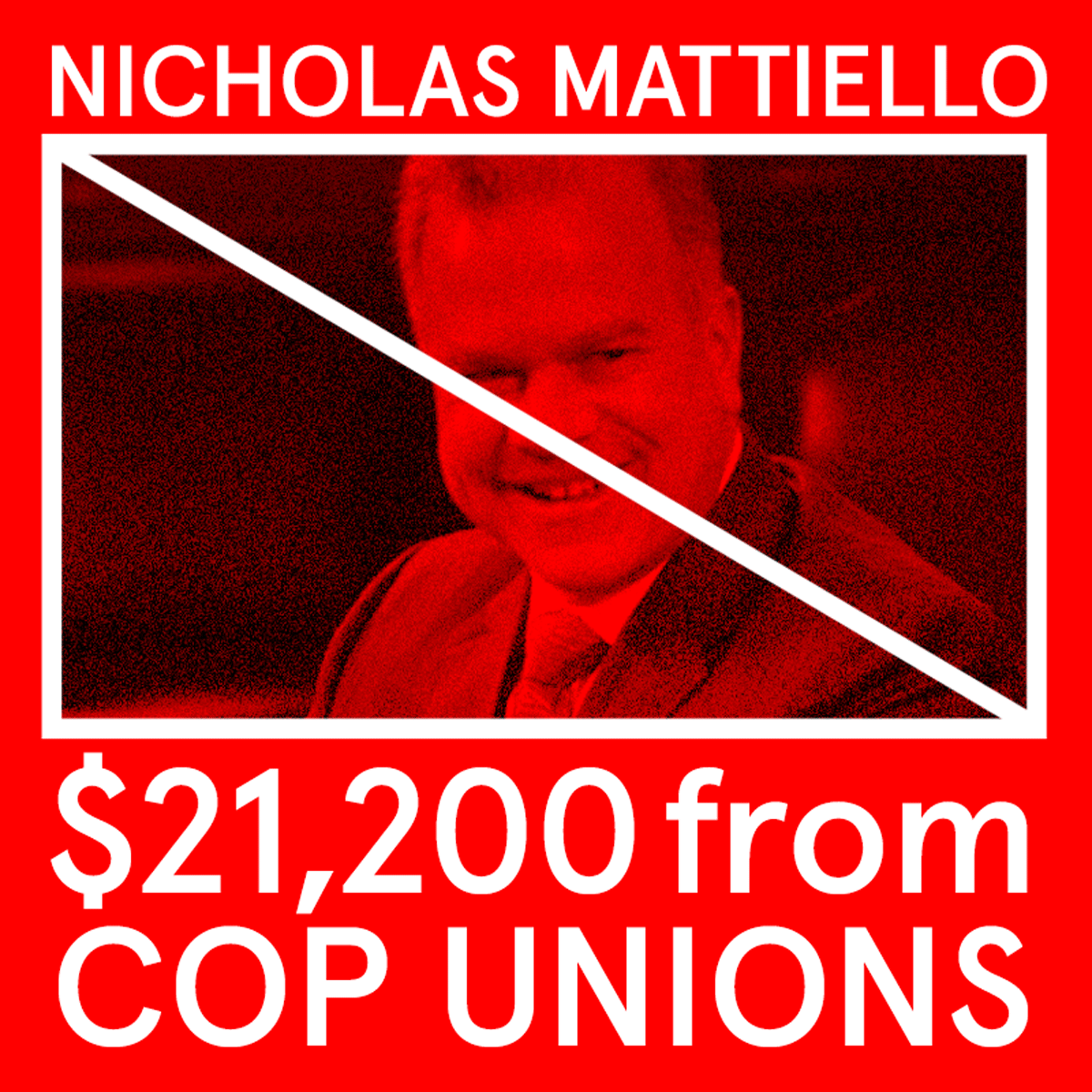
No Cop Money RI

For this website, I struggled to define a graphic identity for the 2020 photography thesis show. After pulling an all-nighter to incorporate multiple last-minute notes, I finally settled on a simple, but effective, website that could responsively account for the multiple artists and their writing.

Glyphs

a. Proposed graphic system
for an upcoming exhibition

b. Bryggen UNESCO redesign

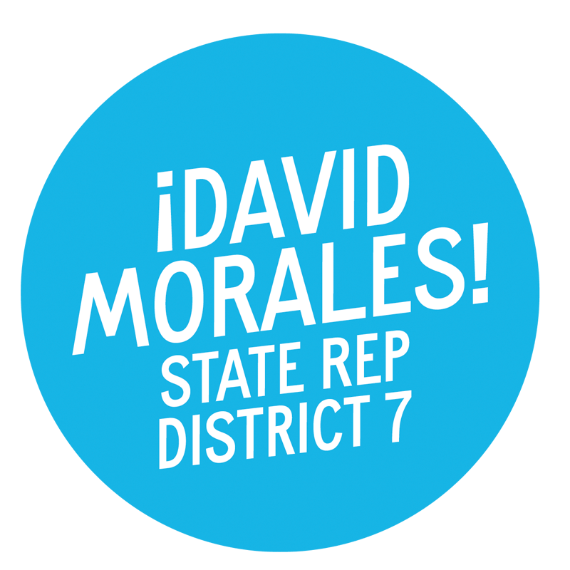
c. David Morales campaign
for State Representative

logomark

d. Logomark for "From the Archives"
Project for RISD Media

e. Variable Typeface

f. Proposed logomark develop with Python

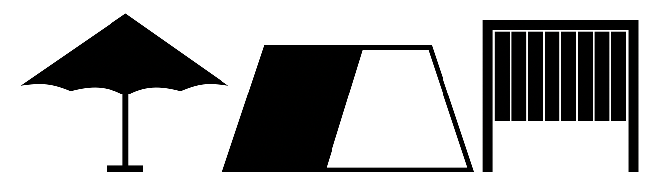
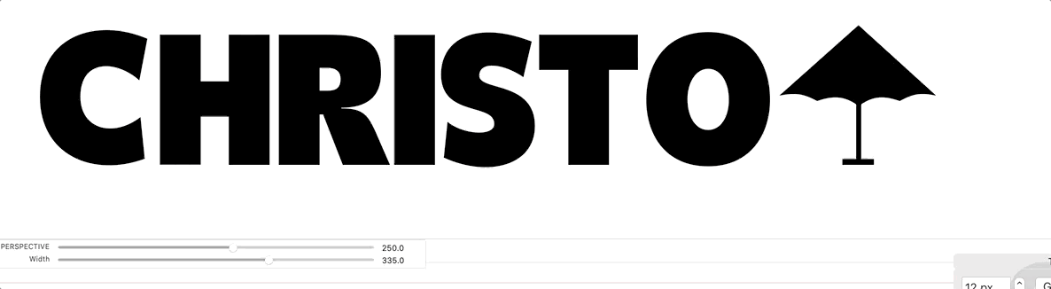
g. Glyphs from the variable typeface Christo

h. Gif from the No Cop Money Campaign

i. Mega City Records Logo

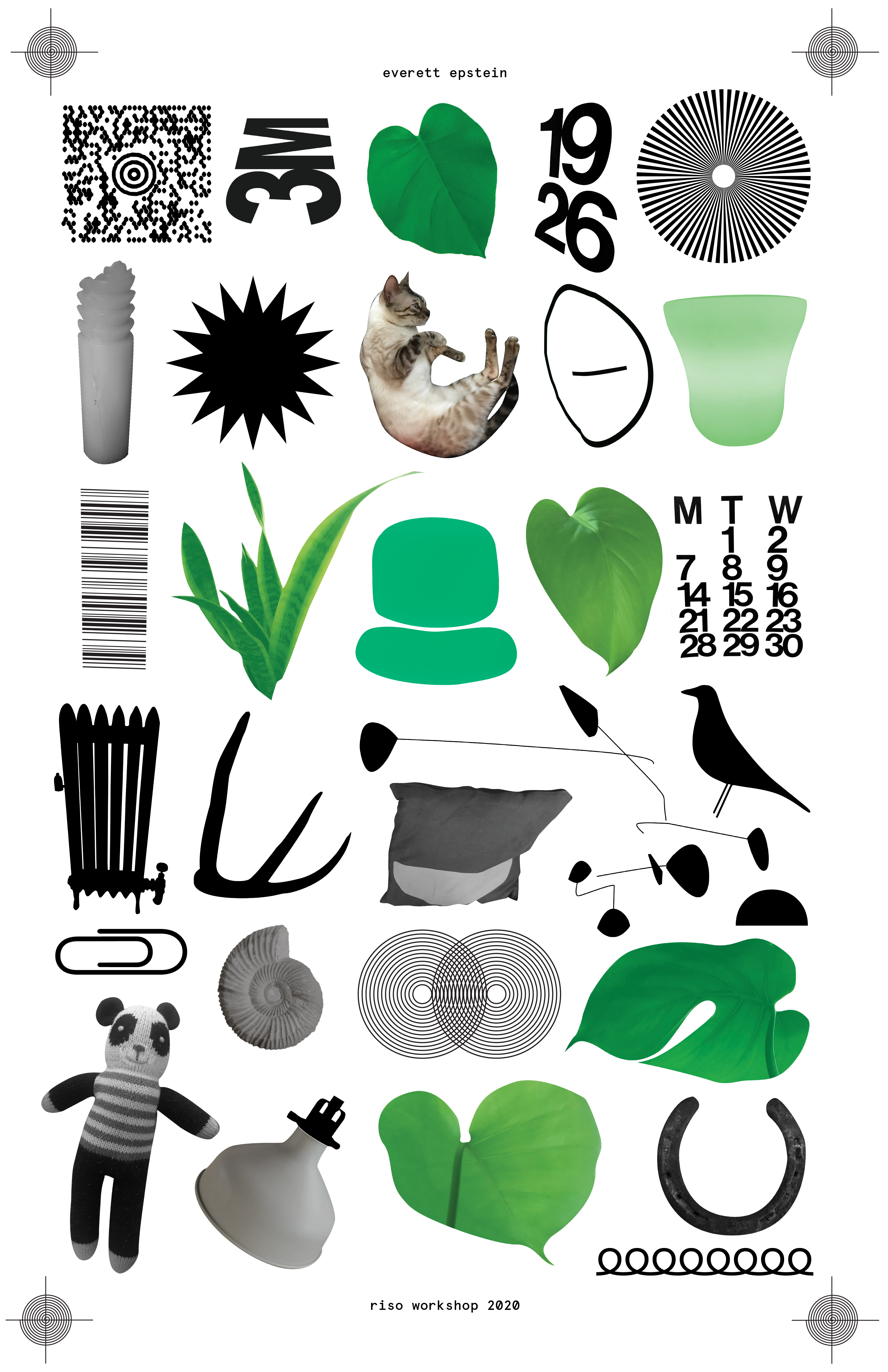
j. RISO-Graphic Marks

k. Join the DSA Instagram graphic

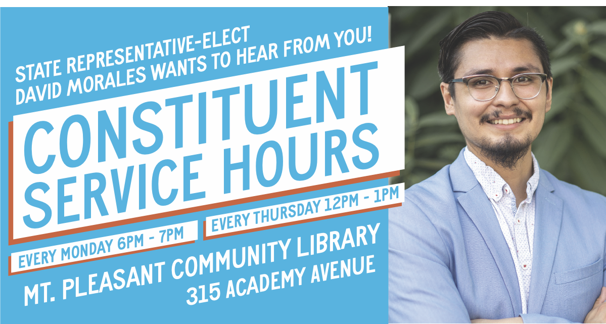
l. One element of David Morales's Campaign

Resources

Presentation Diagrams

a. connection

b. disassembly

c. fold

d. creases

e. risograph → layers

f. code → nests

g. writing → assemblage

h. type design → gradations

i. meaning in the shadows

j. in the contours

Flatlands & Folds

    Hi. My name is Everett Epstein, and I'm in my third year in the MFA program.

  1. Diagramming my thoughts for the thesis, like many in our cohort, involved a collaging of terms, ideas, and feelings. Ampersands, anxiety, symptoms, and the indoors—all of these atoms of meaning felt appropriate, but without a single vehicle to direct and drive an audience (or reader), these points spin off wildly in all directions.
  2. In short, I needed a form, a parenthesis, somethings to frame, orient, and narrow my focus. Enter Christo.
  3. At the end of May, just as I settled into another 3 months indoors, Christo died. Admittedly, his death did not register as especially surprising or tragic; at 84, he had enjoyed a long and respectable career. I hadn't really engaged with his work beyond a vague memory of the Gates, which felt more akin to Cats or visiting the Empire State Building than a site of rich aesthetic inquiry. I guess that I viewed the work of Christo and Jeanne-Claude as tourist attractions—a bit kitsch, a bit flat. The stuff of the mainstream.
  4. Then, I saw the Maysles Brothers' films that chronicled their nearly 50 year career. Deft political manuevers, relentless canvassing, public failure, large-scale success, boundless passion, a commitment to form and freedom—it was suddenly hard not to see Christo and Jeanne-Claude's work as endlessly coded, as limned with the questions of our contemporary moment. It's hard not to see their work as graphic.
  5. In my thesis, I’m hoping to thread the needle of academic and public, of the private and the generous. Throughout the last 3 years, I've had to frequently confront this tension and complicate my own relationship to the glyphic. In this way, I've begun to treating Christo's forms as ciphers—as allegories—to better understand my own practice, one entangled in the public, the political, and the aesthetic. His glyphic object becomes the inscription space for my work.
  6. This makes sense because, principally, as a designer, I appreciate the glyphic object's ability to analogize the personal, to invite disassembly and interpretation.
  7. My work aims to welcome a public into this process. Take The Discreet Life of the Emoji, which traces the supply chain of one of Unicode's newest emojis back to Chile's copper and lithium mines. Drawing on Martin Arboleda's book Planetary Mines, I developed a symbol language that follows the links in the chain of extraction. Indeed, using a open mapping API, I could give texture and image to the exploitative labor systems ravaging Chile for the past 10 years. I tried to also capture the grammar of techno-capitalism through the dropdown prose poem (in yellow). By making this website, the contours of a single graphic form, for me, now nests a rich materialist critique.
  8. This deconstruction requires a folding of the emoji's linguistic material. It asks me to accordion meaning, a process I found myself turning to frequently during quarantine. In (Still) Here the silhouettes of long walks, my only contact with the outside world, were then folded onto a map and the audio of the walk was then archived in the dynamically drawn shapes. I allowed these contours to emerge organically, to build shapes reminscent of Ellsworth Kelly's paintings or Dazzle ships; however, unlike these two references, this site pursued an alternative project. These forms—and accompanying writing—do not replicate or conceal, they rather memorialize moments of relief, of sounds, of memories.
  9. Throughout this education, I've learned to better pay attention. To my references, to my craft, to the creases left by the fold. By making— even in this weird, precarious time—I've come to recognize how my available tools all crease distinctly.
  10. Currently, I'm drawn to the RISOgraph, Code, Writing, and Type Design each of which offers a different thread of thought.
  11. The RISO encourages an appreciate of contour and strata. This zine collection, for instance, used the tool to draw silhouettes around fragments of mouths, allowing silent figures to newly speak, to be read, as color and shape.
  12. The RISO also naturally complements Christo's unbuilt mastaba, a form practically asking for vibrant, spot colors.
  13. Code, especially during the pandemic, has been a welcome retreat, and perhaps fittingly, it's logic encourages a kind of nested design. Across my compendium website, I parenthesized fields of writing, ideas, and emojis. Buried in a simple logic of hover effects and color, I've lodged anecdotes, research, and hidden planes of meaning. If you click here, there's an emoji mode that translates the text to a new glyphic form. I've also include a Projects Scroll and a Process Scroll, along with my research questions.
  14. In a project for my local DSA chapter, I helped developed a website to track the flow of police and corrections money in Rhode Island. Here, in the identity system and the logic of interaction, we wanted to use graphic design and code to develop a tool demanding more from elected officials. In the process, we also accurately mapped the hidden shadow of conservative action in our little state. The shibboleth of Rhode Island politics became slightly clearer when you followed the money.
  15. I've turned to writing as a space of assemblage, a practice to twine together bursts, chunks, and snippets. The web in a natural place for this kind of meaning-making. Currently, I've been using the container of the digital book to house a printable archive of my thoughts, a space to neatly re-assemble the detritus of disassembly. This space, also, allows for endless customization and editioning; with a few js libraries, I can author new interactions (new folds even) for an already interactive medium to make each book unique.
  16. Finally, over the course of this year, I hope to turn to type design to better recognize the gradations that glyphs contain—to look underneath the folds of my practice and notice the shadows created. Type, the constituive shadow behind language, feels like a natural extension of my interests. I'm currently designing a variable, color typeface, that I'm calling "Christo." It uses the Mastaba, the Gates, and the Umbrellas as codexes to make letterforms, which I then map to a perspective axis. The final result will be a typeface that has a built-in projection map, allowing each letter to seamlessly drape itself (much like Christo's wrapped bridge) onto a landscape. This typeface, in short, attempts to reimagine the character of Christo's glyphic sculptures; it attempts to make the flat dimensional.
  17. Fittingly, it's current iteration feels like opening an umbrella. Like an unfolding.
  18. This year, I want to occupy this place: the shade under the umbrella, where dust motes float obliquely.

For my one-pager, I've built a mini website contains the script to my presentation, diagrams, resources, additional glyphic work, and a collection of websites. I've also provided links to my compendium, writing archive, and presentation.

Thank you.